
Do you know why fast food chains generally use red and yellow in their restaurants? Why do luxury goods manufacturers often use dark purple and gold in their brands?
The answer is simple, that is "color psychology".
Even if we did not notice this, the colors that people see still have a direct impact on their senses. The difference in color or even the intensity of the color may trigger a strong physiological response that we cannot control. Therefore, alliance personnel who understand how different colors affect consumers will be more capable of producing excellent advertisements.
Below, we will introduce the theory of color psychology and how affiliates can use this concept to increase advertising conversion rates.
The theory behind color psychology
Although much research is needed, experts have determined that there is a certain connection between color and human emotions.
According to the color psychology theory, different colors will trigger different emotional and physiological reactions of human beings. Not only that, people also associate certain colors with different objects or events, which can trigger specific actions or change the user's perception.
What should affiliates pay attention to when making CTA
The CTA in the ad tells the user what you want them to do, but it takes more than just the correct wording to achieve this. In addition to the text, size, and shape of the CTA button, you must also consider what color should be used.
Some things to note are:
Color psychology
It’s important to understand the response of each color, so you can use the right combination in your ad.
Red: represents enthusiasm and importance. Everyone knows that this color can raise blood pressure
Orange: optimistic, happy, confident
Yellow: Happiness and attractiveness, it goes well with black
Green: success, nature, health
Blue: trustworthy, relaxed and safe
Purple: creativity, luxury, purity
Black: elegance and power
White: ethical, clean, innovative
Gray: professional and neutral
Importantly, the color tone also affects the intensity of the triggered reaction. The lighter the tone, the softer the effect; the darker the color will trigger a stronger response.
cultural difference
Before making a CTA, you must know as much as possible about the audience, including their cultural interpretation of color. For example, white is considered death in China, while Brazilians use purple to express their condolences. Understanding these differences will help you to create better CTA and advertising to a certain extent, so pay more attention to color information, so that you can better create landing pages.
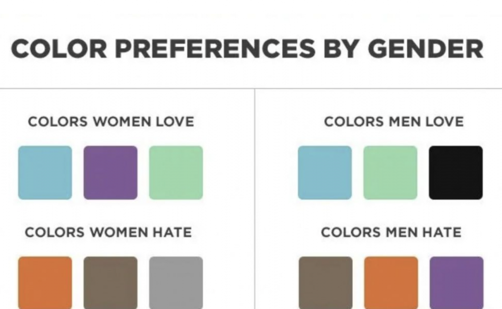
Gender differences
Remember, men and women react differently to the same color. Some of these different factors are related to the environment and culture, but most women tend to have high-gloss primary colors, while men prefer green and black.
Seasonal palette
In the process of choosing colors for advertisements, seasonal factors are also something that should be considered. Of course, it is not necessary to consider this, but the use of appropriate colors in advertising will help attract consumers who are looking for seasonal products and improve their customer experience.
How to implement the correct color strategy
The first step is to understand how color affects consumer behavior. Now, go and apply this knowledge in actual combat, and then adjust your strategy at any time.
In order to determine the color scheme with the best conversion rate, please focus on:
A/B testing
You need to build a Split test with multiple CTA color variants, while carefully monitoring the audience’s reaction to each variant. As the event develops, you will be able to identify patterns that have the ability to promote and narrow the scope of choosing the best solution.
Contrasting colors
Contrast and complementary colors can improve the user experience, and can also be used to highlight important information about promoting products or services. As far as the CTA button is concerned, it is best to use contrasting colors to improve its reliability; complementary colors are more suitable for logos or other brand elements.
For affiliates, the simpler way is to consider the color configuration according to the corresponding industry.
Dating and making friends: red, pink and black
Lucky draw: white, black, green, orange and red
Finance: green, blue, black
iGambling (gambling + betting): yellow, brown and green
Streaming media: red, black and orange
Games: blue, green and pink
Nutra: green, red and brown